Colors are those subjective elements in web design that make people diverse their opinions and evoke reactions just because of their taste, education, cultural background or other things.
In the entire history of web design, the importance of colors has been highlighted and brought up to different levels including the creation of separate jobs like color consultants or brand consultants – highly sought specialists nowadays, as their services are appreciated by business owners that tend to expand their presence on the web.
And there is a good reason to it actually because knowing how colors impact users are valuable expertise, designers can use to help clients choosing what they need for the best performance. But the story goes deeper since having a simple color tone changed can generate different feelings also based on cultural differences we’ve mentioned previously – as what is happy and uplifting in one country, may seem sad and depressing in another country
Since the entire topic is way larger than what Mobiteam’s articles may be, we will be talking here about the history of colors, how they are used and what do colors evoke when being seen on the web as a core-tone of a page
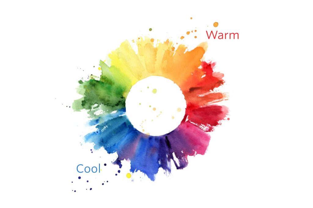
#1 Warm Colors
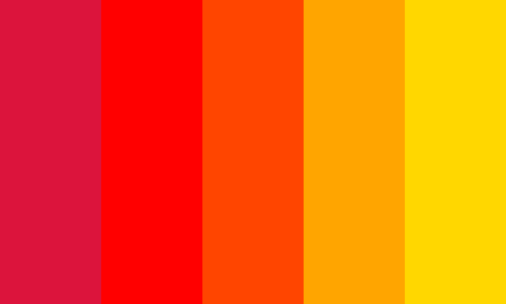
Warm colors that we all know are red, orange, yellow and the variations of those three. They symbolize fire, desire, passion, love, sunsets, and sunrises. These are energizing colors that inspire power and affection as well.
The primary colors in the entire specter are red and yellow, while orange is in the middle by combining the first two. Their warmth is true and confirmed by the simple fact that are not created through a combination of a warm color with another cold color
Red, which is the primary and core color of warmth, is associated with love, passion, warfare. This very contrasting and active combination has its roots in history when both the devil and cupid are represented by the same red color.
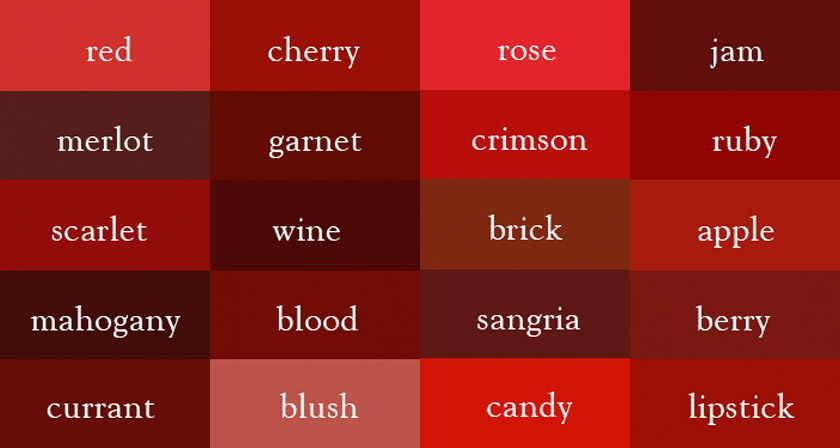
Red is also associated with anger, but as well with importance – a reason for which all warning labels and traffic lights have red inside of it. In other countries outside the western world, red means prosperity and happiness – in China, or mourning – in South Africa.
Taking this into consideration, we can now use it in web design mostly like an accent color. Using it too much may create an overwhelming effect, especially if you use it in its purest form. But if you are going to use other shades of red in web design, it is very likely to give a page specific effects and attributes: Brighter shades of red create the energetic effect, while darker tones may come as powerful and elegant colors.
Orange is a secondary color, produced by the combination of red and yellow, and is something in between. This makes orange as a changing, dynamic, and positive color. Usually, orange is associated with autumn, or sunset and sunrise. Also, due to the fruit with the same name, it is also combined with health and vitality.
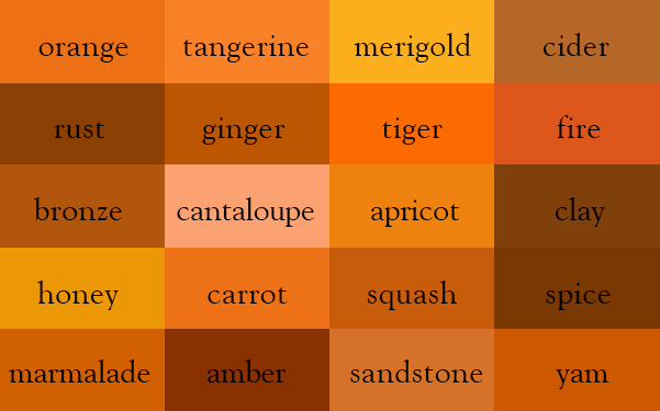
In web design, orange grabs your attention right away but is softer than it’s bigger brother – red. It is friendly and inviting color, and less overwhelming. However, different shades of orange can be too sharp for the eyesight and are associated either with mobility and youth or with routine and monotony.
Yellow is the most energetic and dynamic color out of the warm ones, and it’s often associated with hope, happiness, and sunshine. It is a very positive and vibrant color, the reason for which in different countries is associated with traditions and positive symbols.
In Japan, yellow is the color of courage; In India is the color of merchants, while again, due to the cultural contrast – Egypt recognizes yellow as a color of mourning.
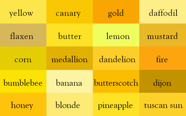
In design, yellow can be used as a color of happiness. Softer shades of yellow are used for neutral-gender color for kids, to the detriment of pale blue or pink. Light yellows are used to share the calm with the audience and bright yellow are highlighting the same happiness of the core-color. Dark-yellows and gold-hued yellows are used to bring a pinch of antiqueness or permanence.
#2 Cool Colors

Cool colors include green, blue, and purple, are often more subdued than warm colors. They are the colors of night, of water, of nature, and are usually calming, relaxing, and somewhat reserved. Blue is the only primary color within the cool spectrum, which means the other colors are created by combining blue with a warm color (yellow for green and red for purple). Because of this, green takes on some of the attributes of yellow, and purple takes on some of the attributes of red. Use cool colors in your designs to give a sense of calm or professionalism.
Green is the color that begins the range of cool colors but is not a primary color as you may think it is. It represents starts, beginnings, and growth. On the other side of the board – green may be used in cases of jealousy or inexperience.
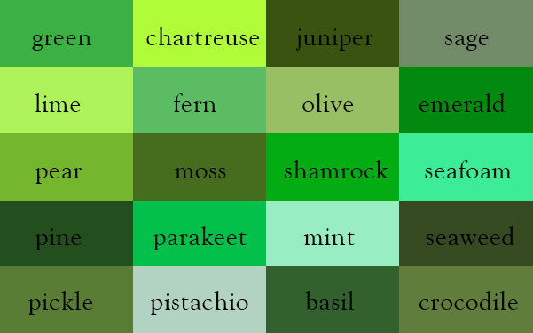
As being caught between blue and yellow, green lends properties of it’s both core colors, and it generates both energy and happiness and as well as calm and restraint. In design, green can play the role of stabilizing energy and color. It can also harmonize and bind together energy and frost if used on the background of the specific colors.
It’s appropriate for designs related to wealth, stability, renewal, and nature. Brighter greens are more energizing and vibrant, while olive greens are more representative of the natural world. Dark greens are the most stable and representative of affluence.
Blue is often associated with sadness in the English language. Blue is also used extensively to represent calmness and responsibility. Light blues can be refreshing and friendly. Dark blues are more strong and reliable. Blue is also associated with peace and has spiritual and religious connotations in many cultures and traditions (for example, the Virgin Mary is generally depicted wearing blue robes).
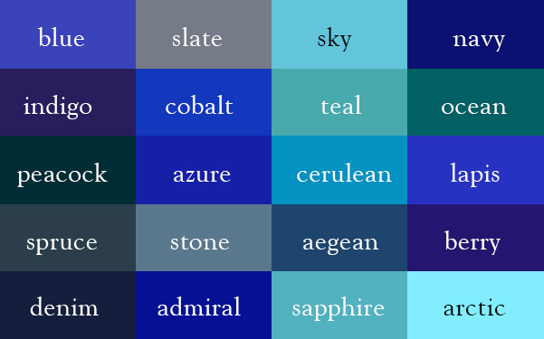
The meaning of blue is widely affected depending on the exact shade and hue. In design, the exact shade of blue you select will have a huge impact on how your designs are perceived. Light blues are often relaxed and calming. Bright blues can be energizing and refreshing. Dark blues, like navy, are excellent for corporate sites or designs where strength and reliability are important.
In ancient times, the dyes used for creating purple hues were extracted from snails and were very expensive, so only royals and the very wealthy could afford them. Purple is a combination of red and blue and takes on some attributes of both. It’s associated with creativity and imagination, too. In Thailand, purple is the color of mourning for widows. Dark purples are traditionally associated with wealth and royalty, while lighter purples (like lavender) are considered more romantic.
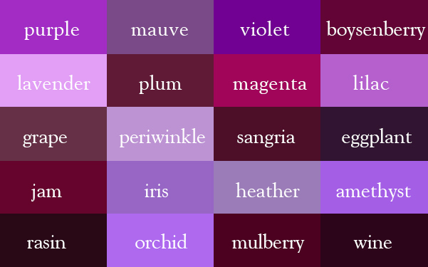
In design, dark purples can give a sense of wealth and luxury. Light purples are softer and are associated with spring and romance.
#3 Neutral Colors
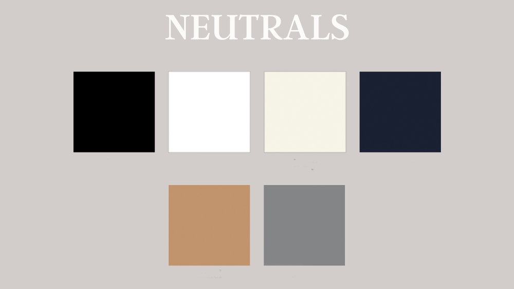
Neutral colors often serve as the backdrop in design. They’re commonly combined with brighter accent colors. But they can also be used on their own in designs and can create very sophisticated layouts. The meanings and impressions of neutral colors are much more affected by the colors that surround them than are warm and cool colors.
Black is the strongest of the neutral colors. On the positive side, it’s commonly associated with power, elegance, and formality. On the negative side, it can be associated with evil, death, and mystery.
Black is the traditional color of mourning in many Western countries. It’s also associated with rebellion in some cultures and is associated with Halloween and the occult.
Black, when used as more than an accent or for text, is commonly used in edgier designs, as well as in very elegant designs. It can be either conservative or modern, traditional or unconventional, depending on the colors it’s combined with. In design, black is commonly used for typography and other functional parts, because of its neutrality. Black can make it easier to convey a sense of sophistication and mystery in a design.
White is at the opposite end of the spectrum from black, but like black, it can work well with just about any other color. White is often associated with purity, cleanliness, and virtue. In the West, white is commonly worn by brides on their wedding day. It’s also associated with the healthcare industry, especially with doctors, nurses,and dentists. White is associated with goodness, and angels are often depicted in white.
In much of the East, however, white is associated with death and mourning. In India, it is traditionally the only color widows are allowed to wear. In design, white is generally considered a neutral backdrop that lets other colors in a design have a larger voice. It can help to convey cleanliness and simplicity, though, and is popular in minimalist designs. White in designs can also portray either winter or summer, depending on the other design motifs and colors that surround it.
Gray is a neutral color, generally considered on the cool end of the color spectrum. It can sometimes be considered moody or depressing. Light grays can be used in place of white in some designs, and dark grays can be used in place of black.
Gray is generally conservative and formal, but can also be modern. It is sometimes considered a color of mourning. It’s commonly used in corporate designs, where formality and professionalism are key. It can be a very sophisticated color. Pure grays are shades of black, though other grays may have blue or brown hues mixed in. In design, gray backgrounds are very common, as is gray typography.
Brown is associated with the earth, wood, and stone. It’s a completely natural color and a warm neutral. Brown can be associated with dependability and reliability, with steadfastness, and with earthiness. It can also be considered dull.
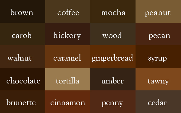
In design, brown is commonly used as a background color. It’s also seen in wood textures and sometimes in stone textures. It helps bring a feeling of warmth and wholesomeness to designs. It’s sometimes used in its darkest forms as a replacement for black, either in backgrounds or typography
Briefly, the entire range of colors you use in web design has or it might have a big impact on your creation. Getting different feedback based on the colors you use is not something out of common. But getting negative feedback based on the colors you use – is an alert sign that you have crossed or near to cross the lines.
If you want to get the perfect color range for your online project – choose Mobiteam. We are the top web design and web development agency from Berlin that can perfectly design your website for the positive feedback and high-conversion rate, based but not limited to colors.