If you have everything ready for launching your business online and only have to decide on what logo to choose to create, then you have to know that trends change more than once per year and every time there is a trending type of logo that breaks the market. But as well, there are different industries where specific types of logos are more fit than others. In the end, it’s all a matter of taste and how well does it go along with your audience.
This article is meant to help business owners and designers as well to choose the best type of logo for them by describing logo categories and setting the logo trends for 2020-2021.
#1 Typography-Based Logos
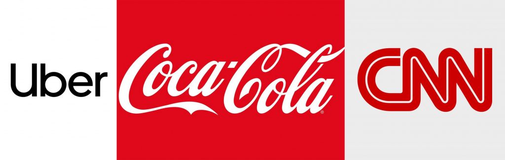
The Typography-based is a big family that reunites three other types of logos: Wordmarks, Lettermarks, and Letterforms. Lots of brand names chose this family: CNN, Coca-Cola, Facebook, Forbes, Uber, Subway and we can count more…
Now let’s talk about each family component apart and set their advantages and features
- Wordmarks – these are pure-word logos, that reflect the entire name of the brand with a particular font and style. Their specific is simplicity and clearness of the brand, and can easily be remembered which improves the impact of the brand on the audience. Also, these logos are easily applied to marketing materials and implemented in marketing strategies.
- Lettermarks – abbreviation logos, that create a unique letter combination deducted from the full name of the company. What’s interesting is that these logos became a trend not so long ago due to the technological impact over social life. People use in their non-formal communication more than never abbreviations: LOL, OMG, BTW, etc. However, time revealed that this was only a spark in different regions and markets. Now, in 2019 abbreviations either evolved or disappeared. On the other hand, this type of logo is fit for long brand names that can transform it into a cool & stylish company image.
- Letterforms – If lettermarks come as an abbreviation from their original name, then letterforms use only one (most of the time first) letter of the entire name of the company as a logo. If designed well, a single letter can have a huge impact over time and expand its influence to maximum (e.g. MacDonald’s, Yahoo, WordPress) but in most of the other cases, this is a tough decision, as a single letter can’t really tell a lot about a brand. As mentioned before, the design of this letter, and how you do it and with what you associate it is extremely important. It must be memorable and produce a chain reaction to your audience.
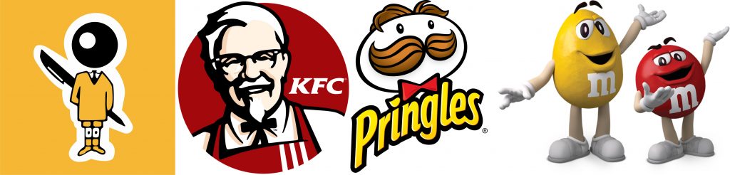
#2 Mascot Logo
Familiar, fun, friendly, playable, cute – this is what most of the time business owners try to associate their logos with mascots.
If you decide to use a mascot as a logo, you must be really in love with them, and able to make others fall in love too. And as well, you have to be sure on your positions that over time, you will focus the entire attention to it, build marketing campaigns around the mascot, lots of commercial materials with that mascot and so on. On the other hand, you may have just acquired a spokesperson for your business that will do almost all the job for your brand. Most likely the food & drinks industry selects their logo as a mascot, as it’s easy to animate your restaurant in a costume of chicken than come with standard photos of juicy grills. It is important to understand that mascots, even though are funny and friendly, may not send the right message to the audience, or at some point, they can’t be used in marketing strategies.
#3 Emblem Logos
Even this type of logos could find their place in the typography family, we decided to dedicate a special place for them due to their historical past and combined components that form up the final element.
Emblem logos have their origins in the ancient to the medieval period when authorized representatives had the power of seal. Seals are what Emblem logos represent nowadays, and give that vintage mood and supremacy feeling to their brands. You don’t have to be for a long time on the market to use an emblem logo, but it’s a must to sell good products or services. Otherwise, you risk remaining with the design only. And it is very important to match the logo design with your industry in order to send the message as clear as possible to your audience.
On the other hand, it is important to consider the customization and the details of that logo: when you add a lot of tiny ornaments to decorate it, make sure that on resize these elements are visible and clear. In this way, you will ensure that on your marketing campaigns the emblem logo looks good and sends a clear message.
![]()
#4 Dynamic Logos
Dynamic logos are associated with a series of elements and can always be updated and adjusted to the context – one strong reason why these are called dynamic logos.
Because dynamic logos are flexible, you can use your imagination and creativity and associate them with different elements in your marketing campaign. This means that you can adjust your logo depending on the sort of product you are providing, season, weather, and so on.
However, you should keep in mind that it is good for your image to limit the number of dynamic elements so that they become memorable and the audience could as associate your brand with your company.
One very important thing to mention about dynamic logos: they are used most of all when highlighting different departments, offices, or branches of a brand, so you may take this into consideration when trying to implement this design solution to your logo.
#5 Abstract Logos
Abstract logos are about creativity and innovation. There is always a hidden sign there, or elements that make you think about where they come from and what do they represent. Abstract logos, after all, come from abstract art and it makes sense to be like this. The advantage of abstract logos is that you decide on 100% how much your brand communicates with the audience. It can be anything, but not anyhow. Usually, abstract logos are so creative that they become more popular than other logos from different categories.
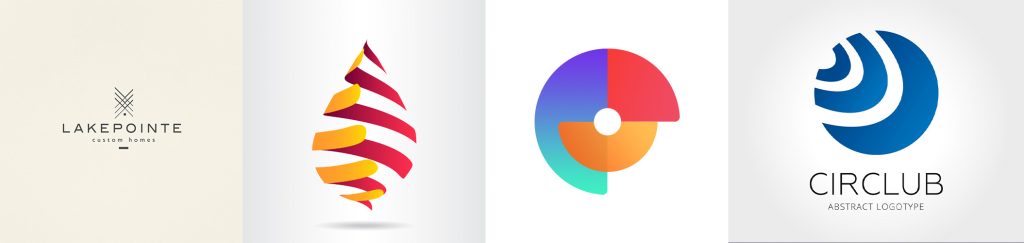
However, with abstract logos, you have to pay attention to details and refine the logo until it sends the exact message. In our case, the Mobiteam logo represents the areas of our activity: Web Design, Web Development & Marketing. Three areas where we proved to on top of the list in Berlin.
In the end, it is important to remember two things:
- Don’t try to change your logo from one category from another, unless your audience will recognize your brand and will love it.
- For best performance contact Mobiteam – we will provide the best web design, web development & marketing solution for your business