
Minimalism in web design has been for a long time a trend that had its ups and downs, but recently more and more web agencies, in particular here in Berlin are creating websites based or derived from this trend.
Generally, there are a lot of adaptations, shapes, and ways to implement minimalism on websites, and web pages, however, there are some guidelines that we have identified in our research and we can tell which of them are making a website successful and good-looking and which of them don’t.
What is Minimalism In Web Design
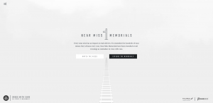
But let’s start with defining what does minimalism really means, and what does it aim. Shortly, if applied in web design as a strategy, it seeks to simplify and reduce the number of navigation elements to a minimum. It aims to provide a clear and spacious user interface with no more than 3 colors used at once.
Of course, this definition is shortened and as well there are exceptions that break the above-mentioned rules, but nonetheless the general guidelines look like you’ve read earlier.
Now that we set up the rules, it is good to know that there are some risks when implementing minimalism in web design. Reducing the number of navigation elements on a website may look awesome, but it can also create UX difficulties, and users may get confused when surfing & searching.
Here at Mobiteam we identify the best web design solutions for a website first and only after implementing them, so if it’s not the case to implement this web design strategy for a project, we just simply find an alternative to it. This is why Mobiteam is the top web design and web development agency in Berlin.
So, what makes minimalism so popular after all and what indicates that this style is present in a web design?! Based on research performed on 204 different websites, here are the minimalism’s best practices:
#1 Flat Elements:
Lately, the trend of digital representations of elements without shadows or other changes has grown significantly. This is explained by the rise of the minimalist trend itself, and the compatibility with flat design. Out of 204 website designs, 93% used flat elements.
On the other hand, it is important to understand that flat design and minimalist design are not the same. While flat design refers to icons, textures, and graphic elements, the minimalist design applies on a larger scale and it concerns layouts, content, features. Flat design may exist without minimalism, while in most of the cases it’s not vice-versa.
#2 Limited colors
Most of the minimalist website designs are using a limited number of colors, or even are monochromatic, as in minimalist design the colors have the role to highlight and get user attention to the main focus points. These can be specific products or services the website owners provide.
This is just another step in simplifying navigation and getting only several things that users should interact with. It logically excludes any other reason for interacting with different elements that are hidden from the beginning.
Another aspect regarding colors is their types: if in the 2000’ website designers used loud colors such as bright red, magenta or yellow, now in minimalist web design trends we can find more black & white and a variety of faded shades of them.
For sure, it depends on the business type and tastes of the web designer & website owner, but most of all there are not more than 3 colors at once on a page.
It is important to understand that when implementing minimalist web design, you should use a color scheme that has enough contrast to be legible for people with visibility impairment and as well to use accent colors to highlight very important information or buttons that should lead to primary actions.
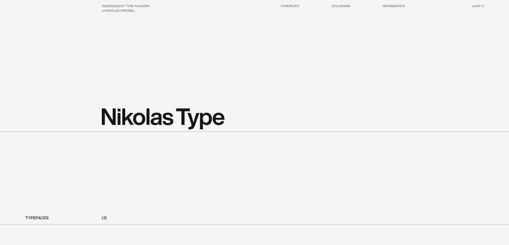
#3 Less Features & Elements
When implementing minimalism in web design, it is important to consider each element and exclude as many as possible unnecessary of them, and let only the ones that send the message of the website and call-to-action buttons.
The understanding of elements can be complicated and misunderstood sometimes, but most of all they refer to images, links, lines, buttons, icons, texture colors & fonts. The less of them – the more minimalistic the website will look. But again, make sure you have the main ones highlighted on the website.
In order to understand what elements are “necessary” and which ones are “unnecessary,” you should be aware first of the website’s target, audience & tasks. When analyzing the 204 websites, we took into consideration if any of them have elements that don’t have a direct impact on users and could be removed without damaging user experience and website performance.
Out of all, 83% minimalistic website had the extra features & elements removed for a better visual impact and user experience.
The conclusion is: The more elements are in the user interface, the more things need to be processed, and thus the less minimalistic everything gets.
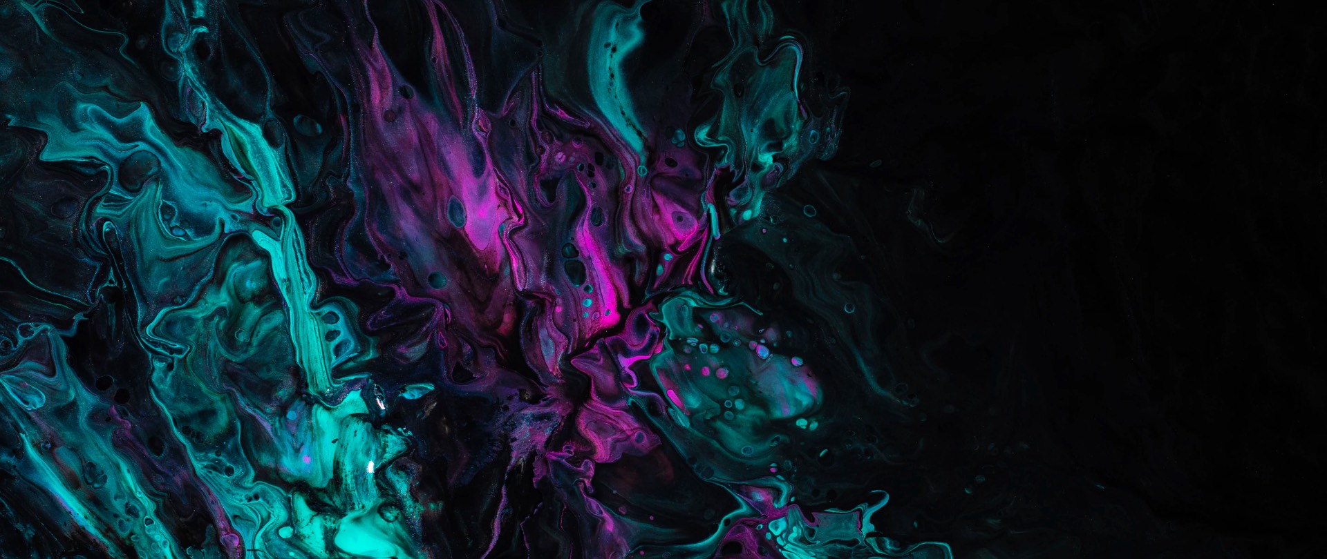
#4 Large Background Images or Videos
When it comes to this feature, designers divide their opinions. On the one hand, the presence of such features is opposite to what minimalism assumes in theory. On the other hand, 63% of all minimalistic websites have this feature included, and they still can be called minimalistic.
Depending on what type of business the website is made for, and as well on the designer’s personal tastes, backgrounds in minimalism web design can help the website to send the message better and if it is the case – to have an emotional impact.
Also, some designers feel that the limited color range in minimalist design can be too boring, and using a colorful background could be a good alternative to black and white.
Conclusion:
No matter how you choose to implement minimalism in web design, we strongly recommend to use it only if it is suitable and if it will work. Not all minimalistic websites can perform great if its aim has nothing to do with the design. And even if you decide to go with minimalism make sure you don’t cut off too many elements out of it.