

We are living in an era where we spend so much time on our smartphones. We miss the phone as soon as it’s not around and we are tempted to use it almost all day calling, sending messages, listening to music, attending online meetings, learning, ordering to eat, or simply taking pictures.
So it’s no surprise that the digital landscape has changed in a remarkable way, namely we’ve moved from a world where websites were designed primarily for desktop screens to one where the mobile experience takes center stage. Hence the name “Mobile-First”! It’s a revolution that has reshaped the way we interact with the web.
In this article, let’s find the answers together:
- What is a “mobile-first design”?
- Why is this important?
- How does Mobiteam excel at creating mobile-first web experiences?
So get ready to get started!
Understanding Mobile-First Design
The term “mobile design” can be seen as a paradigm shift in web development.
This is because, traditionally, we were used to web designers creating websites for desktop computers and then adapting them for smaller screens. Now this practice is no longer relevant due to the increased use of mobile devices, according to Statcounter, over 53.91% of users surf on mobile, especially for web browsing.
So, mobile-first design, just like the name suggests, prioritizes designing for mobile devices, and then considers desktop screens.
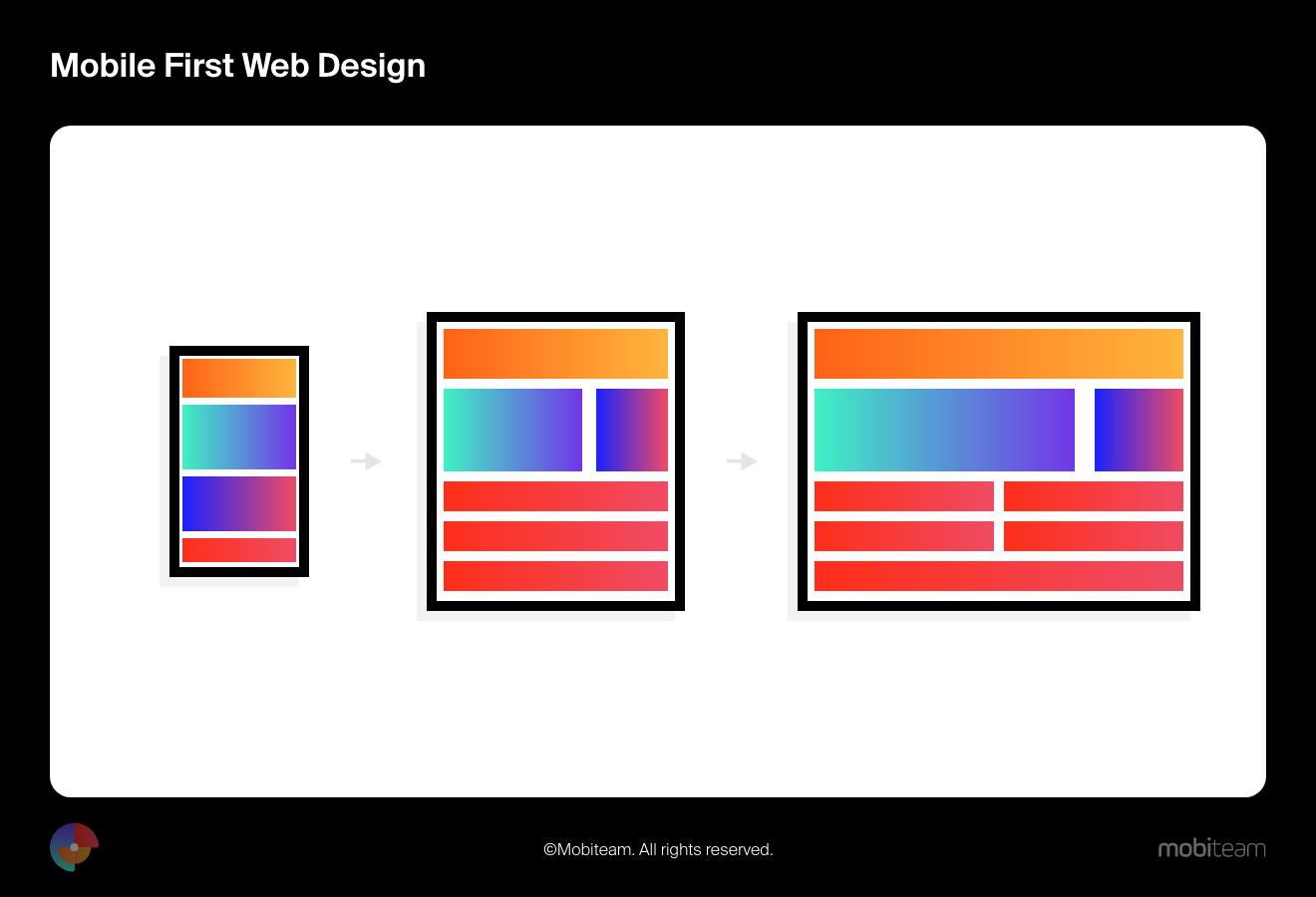
Mobile design isn’t just about scaling down a desktop site, it involves a complete rethinking of the way content is presented and accessed on smaller screens. This ensures that the website is streamlined, efficient, and user-friendly on mobile devices, being a good foundation for a transition to larger screens.
UX Benefits or Responsive Web Design
The importance of mobile design is initially supported by a number of statistics based on user usage of mobile devices.
- In 2022, the average mobile user spent 4 hours and 48 minutes per day on their phone, according to App Annie’s State of Mobile 2022 report.
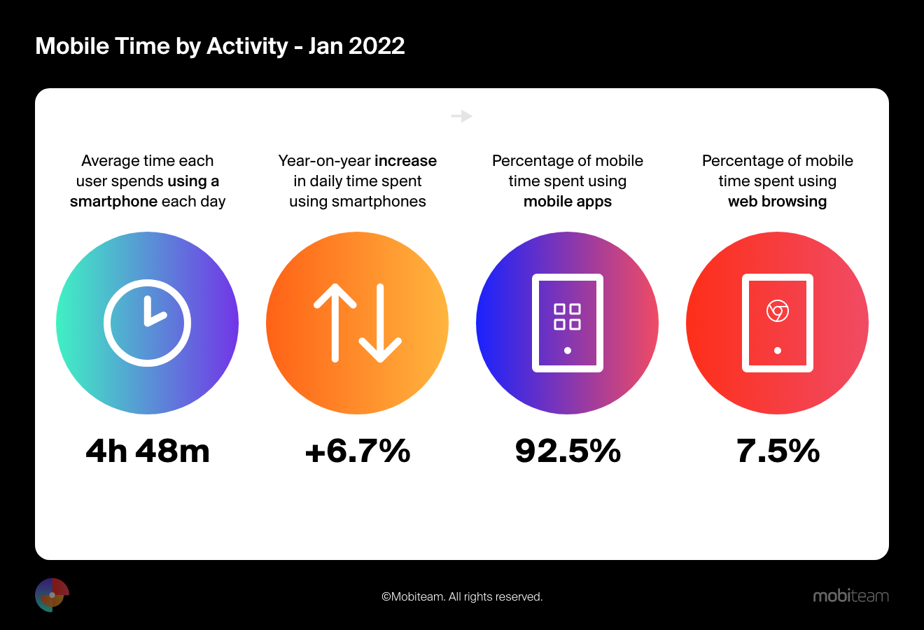
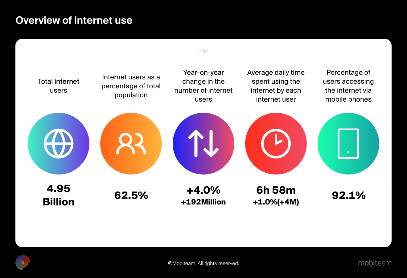
- The total internet users for the 2022 year was 4.95 billion of which 92.1% accessed the internet via a mobile phone.
- People tend to check their phones 58 times a day.
From the above statistics, it’s clear that users across the globe use mobile devices more than desktops. As a result, web designers must prioritize their efforts by following the “mobile first” rule in their design.
And yet what are the benefits?
Responsive web design helps to:
- Improve the user experience on a website that is designed specifically for mobile devices.
- Improve readability and usability as responsive web designs are easier to read and use on mobile devices as content and layout are optimized for smaller screens.
- Faster loading times as mobile-first design encourages the optimization of web assets for smaller screens, which leads to faster loading times on mobile devices, which is an important factor for user satisfaction, as slow-loading websites can drive users away.
- Reduce bounce rate, considering the website is easy to navigate and use on mobile users are more likely to stay which leads to a reduced bounce rate and increased engagement.
- Increase conversions, while users stay longer on the website, interact more, and are more likely to complete tasks such as making a purchase. This way a well-designed responsive website can lead to increased conversions.
- Improve SEO, search engines like Google, prioritize mobile-friendly websites in their rankings, leading to better visibility and higher traffic.
- Improve accessibility, as smartphone use is prevalent worldwide, people of different demographics can easily access information and services.
So, using responsive web design makes websites easy to use on any device, giving everyone a good experience.
Mobiteam’s Expertise: Awesome Mobile-Friendly Websites
Mobiteam excels in creating friendly and responsive websites because they know that a successful mobile design is essential to engage with the on-the-go audience.
We also know that in order to reach the best end result, we need to understand user behavior and create intuitive navigation and responsive layouts, and all this cannot be possible without close collaboration with clients to ensure that their sites not only look amazing but also work easily on all devices.
Here are some mobile-friendly web design projects created with passion, dedication, and professionalism by us, Mobiteam.
Vexperio – Travel Website
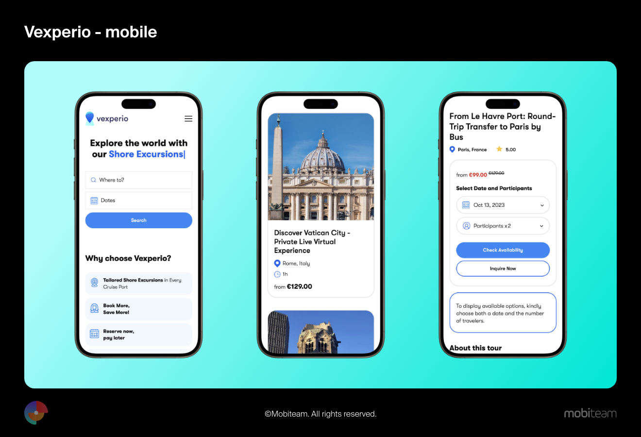
We have designed and developed a mobile-friendly website, an automatically adjusted layout makes the content fit different screen sizes, making it easier for users to browse their favorite destination. Large fonts and buttons make it easy to book private tours, shore cruises, or other virtual experiences right on their mobile devices.
Martely – Fashion Website
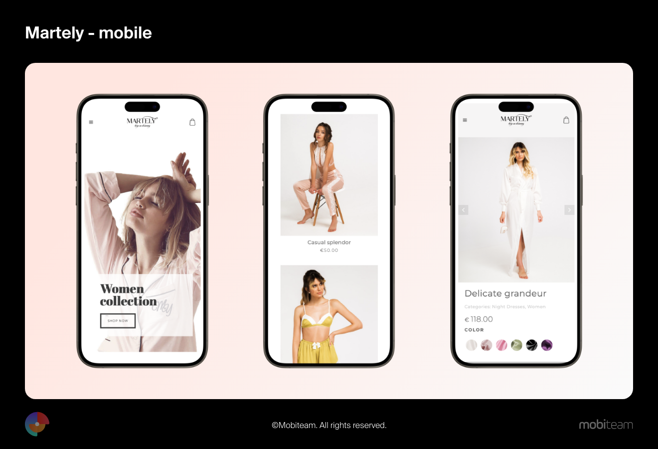
The website has a simple and clean design. It’s visually appealing and easy to navigate, which is so important when you have a small screen, but at the same time, you need to find what are you looking for. The main menu items are clearly labeled and easy to tap. And a very important aspect is the images, which are optimized, load quickly, and look good, perfect to help the user to make a perfect choice, and then buy it.
The DO World – Website for Social Enterprise
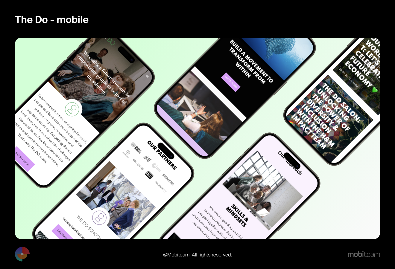
The DO World is a social enterprise that empowers people to take action and create a positive impact in their companies and their communities. It is home to The DO Group, The DO School, and The DO Community.
We designed the site in a very friendly manner and tested it on a few different mobile devices making sure it looked and functioned well on all of them. The text is easy to read, the images are clear, and the features are easy to access. The use of white space makes the website look more modern and professional.
In this connection, we can say that expertise in responsive design, intuitive navigation, and close client collaboration is one of our secrets to building awesome mobile-friendly websites.
Closing Up
At the end of this article, it is essential to mention that mobile-first design is not only about design but also about the success of your business. Mobile-friendly design is becoming a strategy and one of the best practices to be used to be successful in our digital times when technology is evolving and mobile devices are an integral part of our lives.
Update and optimize your digital products!
Consider your users’ needs at every step of the design process, and they’ll thank you with increased conversions, less bounced racing, improved engagement, and overall satisfaction on both sides!