Web designers and web design companies are always enthusiastic about what trends mean and what trends stand for. But if it is to take a closer look, it’s a two-sided coin that has both positive and negative parts:
On the one hand, trends do mean that you are a part of the crowd once you follow them, and thus, using creativity in the design process feels less than when creating from scratch a unique design apart from the trends. As well some may agree that creativity is the core of what web design means, and the more a web designer use it – the better.
On the other hand, “creativity is knowing how to hide your sources”, as Einstein once told, and as well, not making the design according to the latest trends makes your work either weird or brilliant. And it’s a risky challenge, to be honest.
Anyway, knowing what are the latest trends, especially in web design is just a matter of time; And deciding which one to adopt and implement talks a lot about cultural beliefs of a web design agency, styles that a designer moves closer to, and inspirational appurtenance.
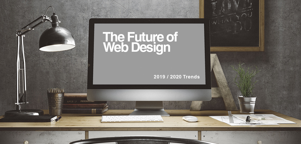
Together with Victor, the Head of UI/UX at Mobiteam, we identified and explain 3 most trending features in Web Design, for 2019-2020:
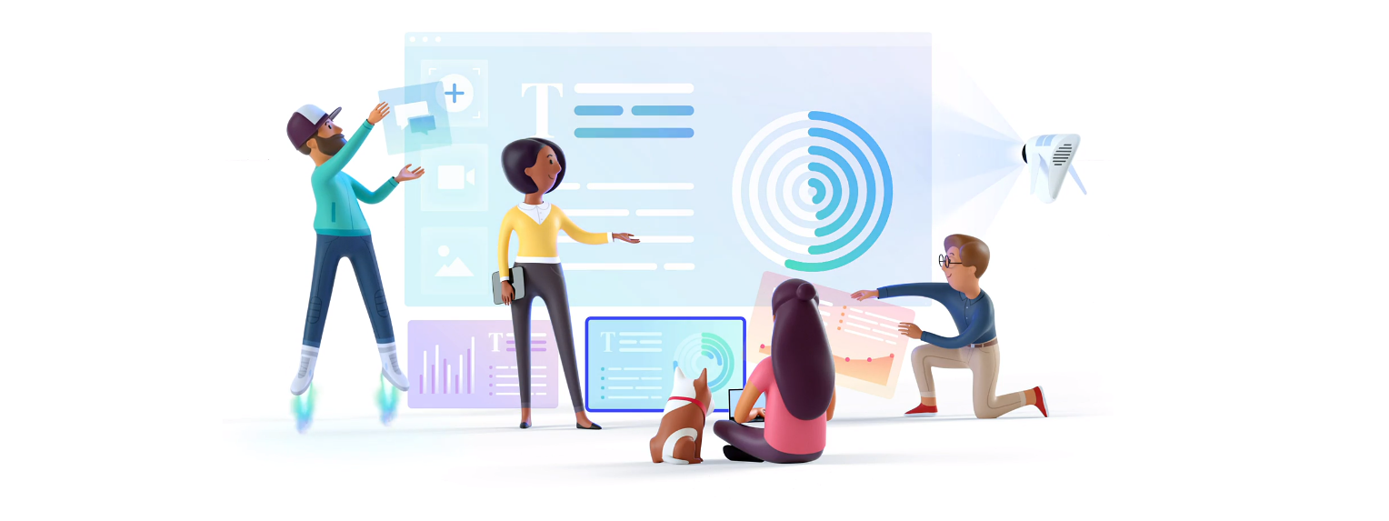
#1 – 3 Dimensional Illustrations
Even if not so long ago flat illustrations and designs were trendy and even were brought to another level by famous co-working tools like Slack, 3D illustrations seem to emerge as a new trend, that combines together digital world and humans.
This trend is starting to be used more and more by big companies, as it provides a better UX, it’s easy to understand the message from one picture, looks joyful and explicit.
As a matter of fact, what makes this web design trend so easy to assimilate is that it actually displays users into the product, and in this way sends a clear message that the product is accessible and easy to use.
A good example, in this case, is Pitch that went even further with this topic and slightly animated illustrations.
#2 Helvetica Branding
If by any chance you take a closer look on how logos and brand identities evolved in the last 2-3 years, probably you will notice that most of them look playful, no matter how serious the business is.
But, as a reverse process of what 3D illustration mean, some major startups and companies have changed their logo into something more serious and solid.
Most of the times it’s about fonts, but it touches the logo archetype as well, at least in some cases. The most iconic brand that changed this way a long time is Microsoft’s most known product: Windows.
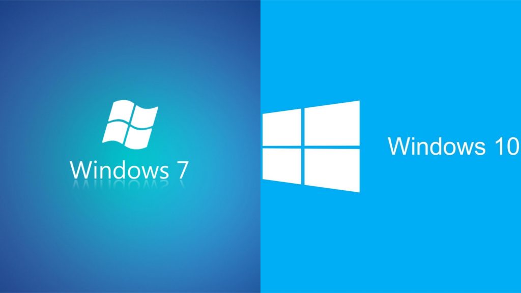
But this long story on how Windows changed its design was followed by other brands as well, and the reason to do so is to provide a solid, corporate image that talks for your business in advance and inspire more trust.
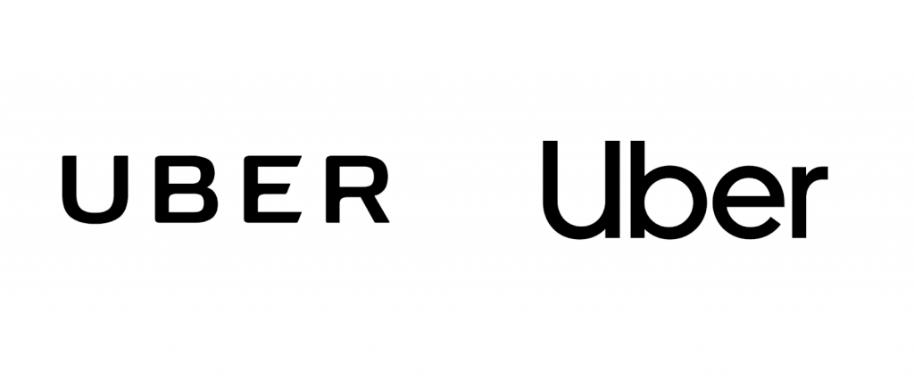
Uber, for instance, followed the same example and uses sans serif to consolidate their image – a marketing move that it may be related to the problems they’ve got in different regions and countries
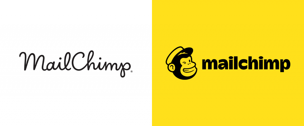
Also, another reason for rebranding the corporate identity of a company is business maturity. When your business reaches another level you know that it’s time to make a change that will tell everyone about it.
MailChimp actually went through a lot of changes and is the perfect example of this trend. As you may remember them cheerful, young and handwritten a while ago, the Little chimp has grown up and lifted their image accordingly.
#3 Massive Text
For newspapers & magazines this might be something familiar, and in practice showed good results, especially when you are far away and you see the title, that will ultimately trigger the well-educated citizen from New York in ‘60 to buy it.
Yet, this trend somehow appears to be used more often not only by newspapers and magazines, even if they are online publications, but the massive text is also used on e-commerce websites.
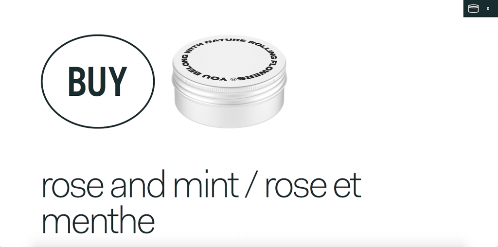
The example of the contrast between a minimalistic website with massive, screen-dominating text is what it seems to get the business rolling for Rolling Flowers. It actually has the same effect as a newspaper seen on a showcase – it triggers, both by huge images/text and as well with loud and clear buy/add to cart button.
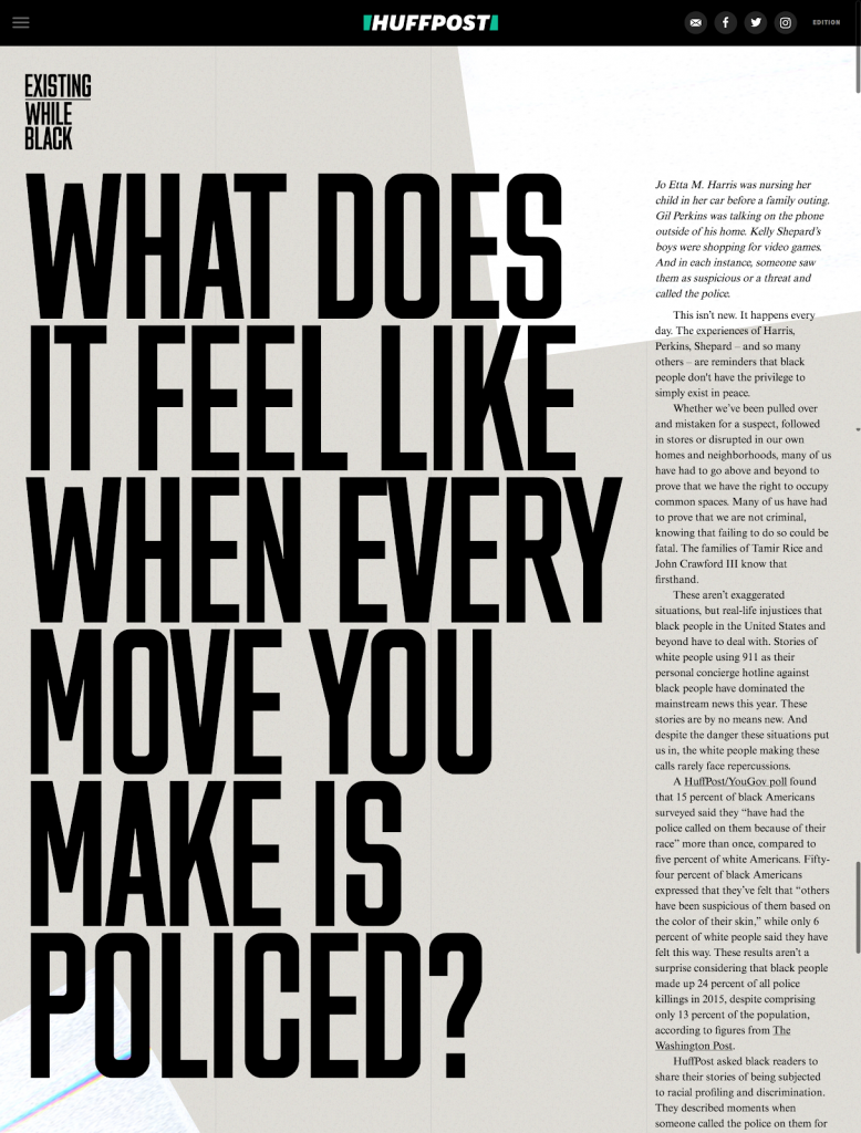
But, if we get back to those newspapers we were talking about earlier, than, the good old massive text is back to work, and adopted by HuffPost in a new(er) manner. It’s all about getting the attention though but is also used as a new brand identity after their redesign
In a digital information era, there is a lot of news and not every piece of information is a useful one – reason for which we recommend to be selective and acquire knowledge from trusted sources.
Even though the trends come and go, and some of them come back, it’s always good to be updated about the latest ones for personal, or professional purposes. But if you are interested in implementing the latest web design trends – you came to the right place: Mobiteam – The TOP Web Design & Web Development Agency from Berlin.