
The trends for UI/UX are always changing and adapting to new challenges and requirements, and that’s at least one good reason to make at least yearly updates on what’s up next and where things are moving to. In this article, we will talk about the 2021 UI/UX trends and also we’ll share several recommendations.
To whom this article is addressed?
First of all, we recommend this article to graphic designers, web designers, product designers, and marketing professionals. The article is about details, elements, colors, and everything in between – so, if your goal is to create an attractive design that sells and highlights specific elements and details that aims to convert users into clients, you might want to read it and implement the recommendations mentioned here.
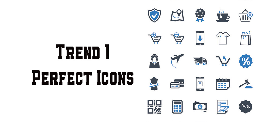
Trend #1 – Perfect Icons
To create bitty icons in 2021 is simply unacceptable. User Interfaces should look perfect and smooth – a proof of experience and professionalism. That’s why a UI/UX trend in 2021 is the concept of perfect icons that fit extremely well to the design and make users feel the icons belong to that place.
If you want to follow the trend, don’t use icons from different families and packs, and also don’t download icons from random websites. Instead, try using icon collections that were created by the same designer, and belong to the same pack, have the same parameters and visual identity.
Icons from different families and collections are disturbing the visual balance and don’t feel too appealing to users.
Right now everyone has the chance to place high-quality icons in their projects since 2020 was a boom for icon collections. Thousands of designers all over the world created and developed icons for all tastes and projects. And because every designer can use great icons for their projects – the quality of User Interfaces grew and “convinced” users to ask for more quality and innovation.
In addition, companies like Apple also follow this trend. At the end of 2020, they updated their macOS Big Sur, and at the same time included a new icon design that is different from other versions.
Another example is Sketch. At the end of November 2020, the company also fully redesigned its icons, and now, everything looks smoother, according to next years’ trend.
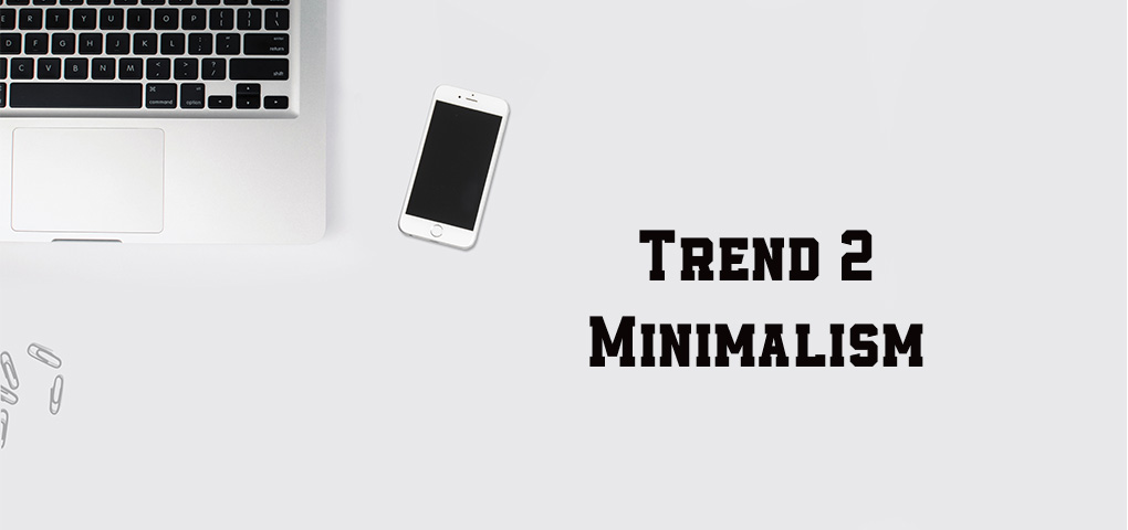
Trend #2 – Minimalism
Minimalism was a trend also in 2019 and 2020. So, what’s new in minimalism you would ask. The thing is that minimalism progressed so much that reached the following idea: The best interface is the one that cannot be seen.
People are spending more and more time on platforms and websites that focus a lot on content and don’t necessarily need a design that will distract users from their main activity. That’s why initially minimalism as an interface was the perfect solution – blank space and almost no elements.
Today, the design as a whole is focused on elements, fonts, icons, colors, and animation. So what is changed since the last time minimalism was applied is the combination of blank space and a minimum of fonts, icons, colors, and animation. Here are several steps that will help you make an existing design minimalist:
- Leave only essential elements visible by default. This will help users to focus on what they need and they will thank you for that.
- Erase all elements and massive colors. Make the content the star of the stage, nothing more
- Focus your design to accent colors, warm fonts and not the other way around
- Pay attention to details, users love them
- Make the interface invisible but at the same time intuitive
- Do not exclude elements that users got used to interacting with.
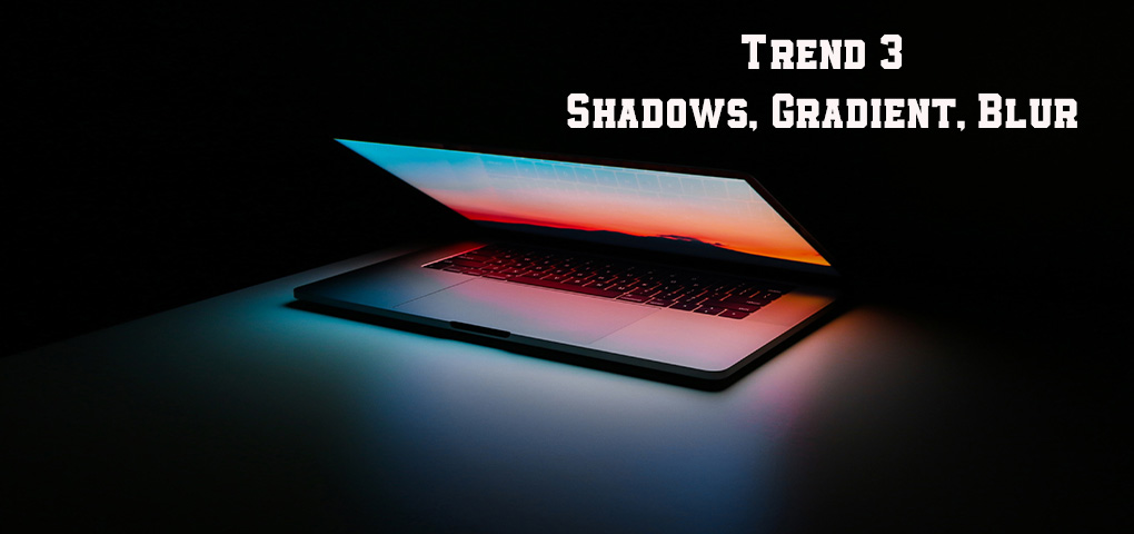
Trend #3 – Shadows, Gradients, Blur
Gradients and shadows are no news to UI/UX trends, but still, these two will be very popular in 2021 as well. Yet, they will bring something new next year – more space and volume to the interface by using pastel colors instead of massive ones. Combined with 3D icons – they will create together new trends inside minimalism.
If in the previous years’ designers were making waves with linear-gradient, right now this is not enough. In 2021, the trends will bring along gradients from 3 or more pastel colors that will create a blur effect, especially for backgrounds. This will allow the interface to have depth and volume and simulate a 3D effect.
These gradients are called Mesh-gradients, and since the trend is right now in the building process, there are not so many resources that provide such gradients.
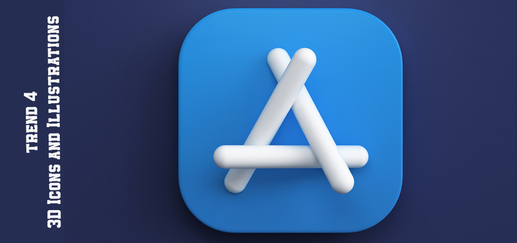
Trend #4 – 3D icons and Illustrations
Since making and learning how to make 3D icons and illustrations are more accessible to everyone, designers create libraries that are dedicated to such elements, and each day these libraries are populated with thousands of new elements. Probably, this is why this trend appeared.
Even if 3D icons and illustrations are not so difficult to create and do not change the design concept itself, they bring along a new and fresh look to interfaces and are much appreciated. However, we do not recommend using 3D icons and illustrations right away. The trend is not clearly defined on what is more or less popular, and risking to use something that will not be so appreciated in the future – is not the best idea.
That’s why there are two ways to approach this trend: to wait until more collections will appear, or order your own individual and customized 3D icons and illustrations.

Trend #5 – SVG & JSON Animations
There will be many good illustrations in 2021, but they will get boring to look at. To make them even more interesting, they will be animated. A trend is already emerging and animated illustrations appear. This applies not only to illustrations but also to icons.
Any small animated details in the interface, especially where they are appropriate, will be a big plus. What are SVG and JSON animations? In simple words, it is an animation generated by code. What are the advantages of this?
- iOS, Android & Web Versatility on iOS, Android, Web, and Windows
- Minimum sizes. Animation files are tens/hundreds of times smaller than graphics in size
- Smart settings, animation reacts to any interaction, controlled display
However, you will need a developer to create and integrate an animation correctly. But this does not mean that the designer cannot come up with animation and interact closely with the programmer or use animation tools. It’s more about the joint work of a programmer and a designer. In any case, the animation trend will grow and it is mainly about teamwork: product designer – designer – illustrator – animator – programmer – tester.
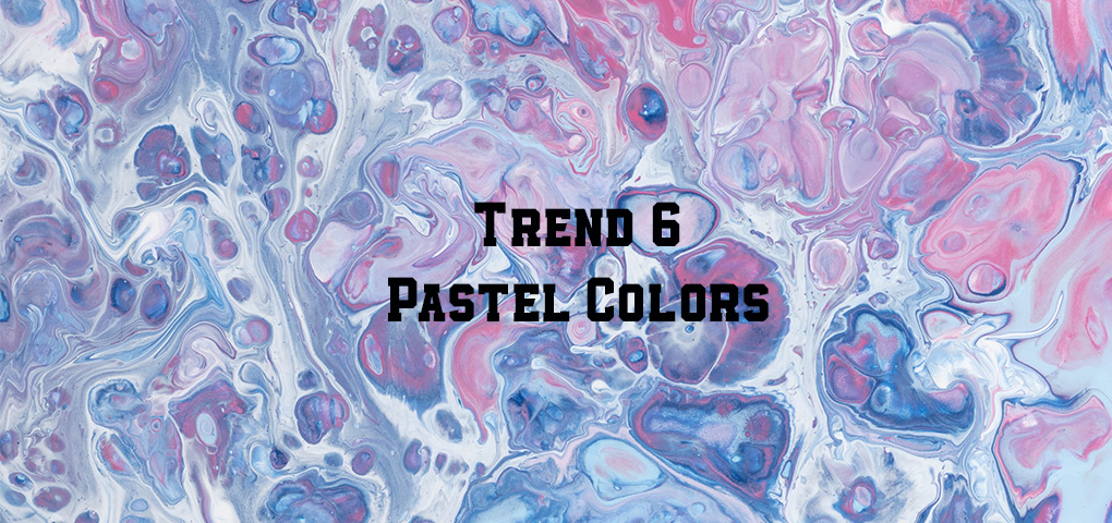
Trend #6 – Pastel Colors
With the advent of minimalism and simplicity in UI design, pastel colors perfectly complement the new trend. They fit well with the concept of an unobtrusive UI, do not overload the design, and maintain lightness. Set the tone and atmosphere.
There is nothing difficult in creating pastel colors: just make backgrounds and substrates in your design as bright and faded as possible. So that they fit well with the overall concept and graphics.