We all must agree that fonts play an important role in brand representations, alongside with logo, and colors. It is a way to show what the business is about, and how it behaves. Sometimes fonts display the power, market position and even actions a brand is predisposed to take – in other words, the business style.
Font impact over the audience is much bigger as someone would guess, and it’s often underestimated. Fonts not only reveal the message but have as well an emotional impact on users. For this reason, you may want to use thin fonts for sensitive cases, big bold fonts for news alerts, or, sans regular for business.
Here at Mobiteam, we have identified Top 3 font trends for this and upcoming year, as being the most influencing trends so far, so let’s take a look at them:
Bold Large Fonts
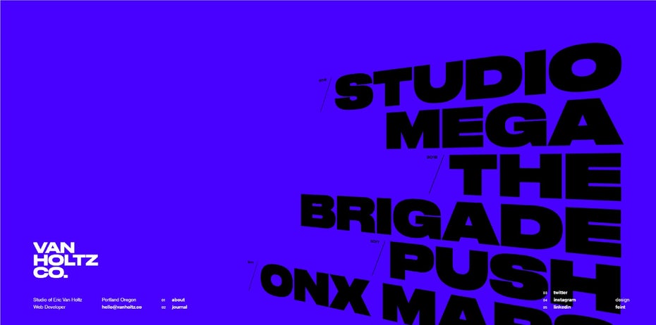
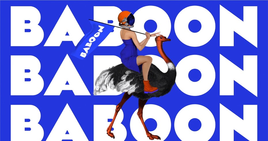
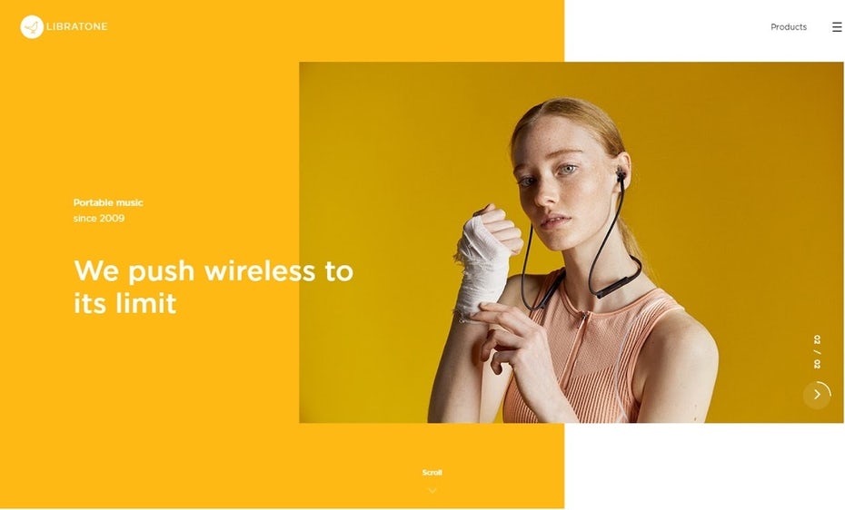
Bold, large fonts are overflowing with expressivity and provide a solid image for places where they are used. This is available both for web, graphics and print designs. It reveals the brand power, clarity, and rock-solid message that sends to the masses.
What’s interesting, is that this type of fonts is gaining popularity and conquer the market. The abundance of large, bold fonts is explained by market demands of clear messages sent straight to users and consumers that will satisfy the need of eye-catchy text.
Also, this font trend confirms and comes in hand with general web design trends that we stated in our previous article.
Here are some examples of how the large, bold fonts are implemented successfully
Minimal Sans Serif Fonts
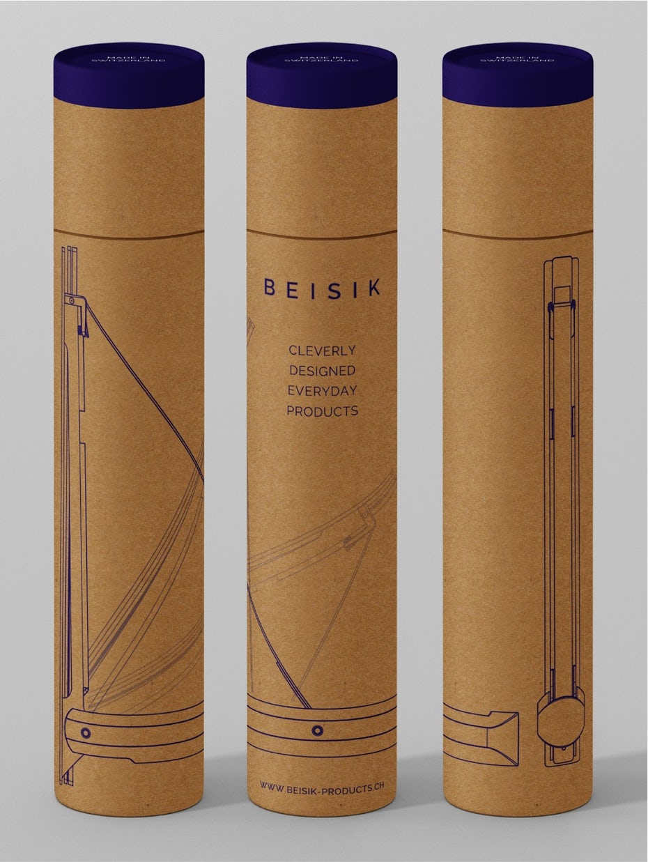
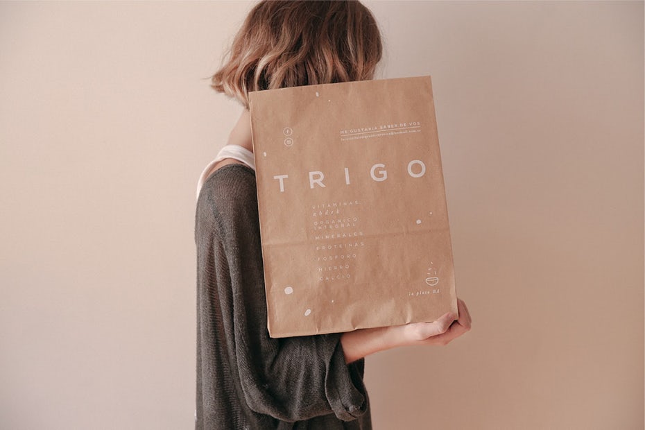
Minimalism font trend continues to be one of the favorites on the market, and there is a good reason for that.
If simplicity could’ve been defined by fonts, then sans serif would win the game from the start. Having minimal sans serif on a logo, design or page helps the eye to capture the entire image, and focus on the message. This is a great design trick that always worked and still works, but permanently adapting to new market challenges.
Another reason for minimal sans serif is that it always looks good with every color and background, offering a corporate image and a lot of space around to impress the masses.
A very interesting thing to notice is that minimalist sans serif comes in contrast with previous mentioned – large bold fonts, but no matter the contrast, in almost all cases sends the same strong message that aims and succeeds to lure and convince of a brand’s practicability and modernism.
Contrast Serif Fonts
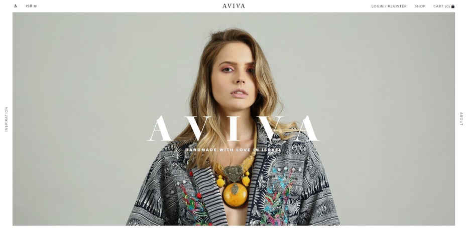
Serif transformation along time is a dramatic one and its variations are extreme. Why contrasted serif fonts remain to be one of the favorite choices of web designers, business owners, and startups?!
Well, because the edgy and sharp corners of fonts are highlighting the text and help to send the message better, and the sensation of clarity makes users feel the context closer to their understanding.
Also, the contrast within the characters makes them look modern & alive. And this is one more reason why contrasted serif feels and is perfect for young labels, logos, and businesses – startups.

Now using trendy fonts or using other fonts to create a trend is a matter of choice. It’s still up to your business, your style. And no matter what, fonts are a way of thinking and a solution to reveal and print your personality on a t-shirt, animation or even a web page.
Discovering new fonts help to know yourself better, but for everything else, there is Mobiteam – The Top Web Design, Development and Consulting Agency


