For a good period now, the dark mode design is trending in both web and mobile design, and even though it has different shapes and shades, reinventing it proved to be difficult enough.
There are many versions and rumors about the history of the dark mode: Some said it’s Apple who invented it, others say about Google, and of course a ton of other versions we’ve all heard about it. If it is to go back to roots, here at Mobiteam, we think differently, and probably you would agree on what made the dark mode popular: the code.
If you are a developer or have seen some of them working, for sure one thing we all could notice is the dark background they are coding on. It is actually for comfort, otherwise, if you are coding on a white background – it could damage your eyes. But nonetheless, admit it – it looks cool, and there isn’t such a big difference between the dark theme of coding/programming tools and the dark interfaces Google and Apple are offering on their devices, operating systems, and browsers.
But enough with the history and let’s move to what is dark mode right now, for “regular users”. As the colors are not the same as in their source of inspiration, the tech giants had to come with an adaptive alternative to their web and mobile design. And starting with another mix of colors, adapting minimalism, rearranging the elements, up to how the entire system behaves – everything was changed more or less, to offer a more simple and at the same time catchy solution than the previous, common white version everybody else was using before.
Showcasing the entire collection of dark modes in the web or mobile design, it would take a lot of time and a very long scrolling page, this is why we are avoiding this, and instead, let’s take a closer look at the color range, and which one for what purpose is used, in the dark modes editions, by almost every dark theme fan.
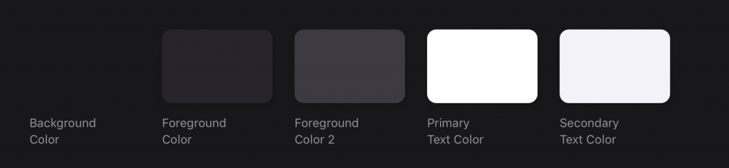
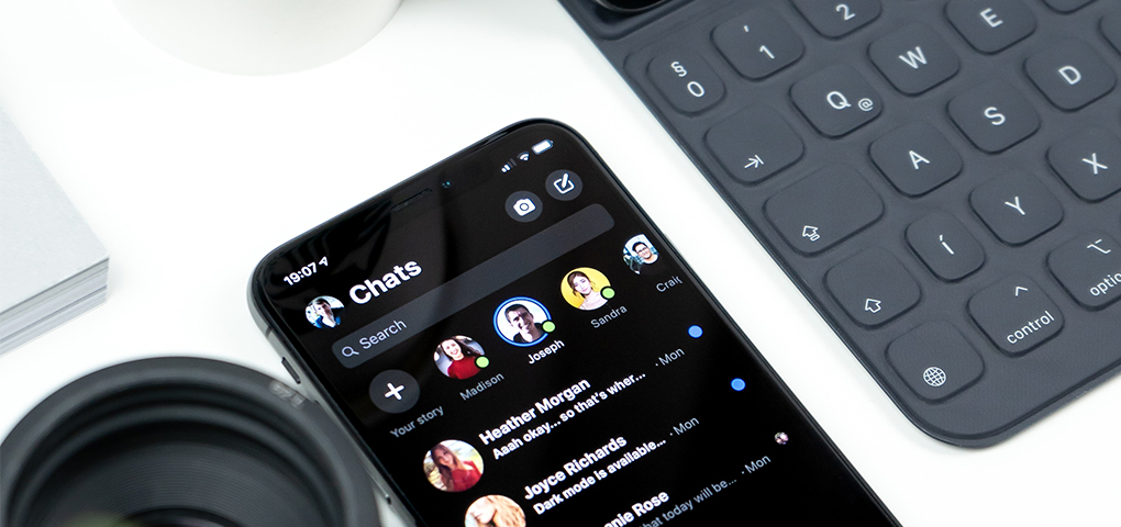
One of the first things to notice in the dark mode is that the white text on a dark background looks bolder than the black text on a white background. This is why UI experts don’t use at all or almost at all the pure white for text. On the other hand, when using a shade of white – they should be careful enough to make the difference, and look clear in all modes, including the situation when you are turning on the night mode over the dar mode for reading in both mobile or web applications.
Another purpose of using a dark theme UI is the same as for coding – it doesn’t hurt your eyes as much as it would do the white, classical theme. So except that it looks stylish and modern, it has a better impact on a longstanding user that is planning to read or to view a lot of content.
Of course, talking about the artistic side of the dark mode UI, the requirements, and how it feels could continue to an indefinite number of pages. And except this, there is the technical part on which designers talk about a lot, and disagree with each other for almost everything: fonts, colors, shapes and shades, elements, 3D and more. We, the Mobiteam crew won’t give a verdict on this, but for those that seek a good enough dark web design or mobile design, we recommend to stick to the guidelines from the giants that have already created and made a trend out of it.
Now, since the dark mode is so popular, and is not only a trending topic among designers but as well a trend among users, it is important to underline the facts that lead to this, and what impact has the dark UI to the entire web design. Does it bring anything new? Or it’s just the reverse side of the white interface
Along the time, there was a series of events that changed the course of the web design trends. Some had to do with the elements, techniques, strategies and everything in between.
The dark mode itself refers more to the color changes in web design and mobile design. But if we look closer, it’s not only about the color, but as well, it impacts the entire experience the user has while on it, and as well, on how other users see the one using a dark mode.
The dark mode, in our opinion, provides the much-expected change the users needed, and at the same time the comfort which transformed it into a web and mobile design trend.
What do you think about the dark mode and how often you use it? And, what do you like more? Dark, White, or Mobiteam?
We at Mobiteam since the very beginning opted for a contrasted website, where dark and white themes blend successfully. We did it even before others, and are very proud that designers made out of our website an example for their works.