Creativity and innovation are defining words for Berlin’s design culture.
The world of web design is continuously evolving and developing web design trends set Berlin apart from the rest. Mobiteam keeps up with the trends and always creates modern, trendy, user-friendly web designs.
Which unique design elements and styles are popular in Berlin web design and how does Mobiteam incorporate these trends in their works? Let’s discover together.
Design Elements – Popular in Berlin Web Design
Firstly we are going to highlight a few unique design elements, popular in Berlin web design, characteristic of the most popular web design trends. These include
- The use of negative space – a space around objects on the page, that aims to create balance and focus attention on the most essential elements of a design.
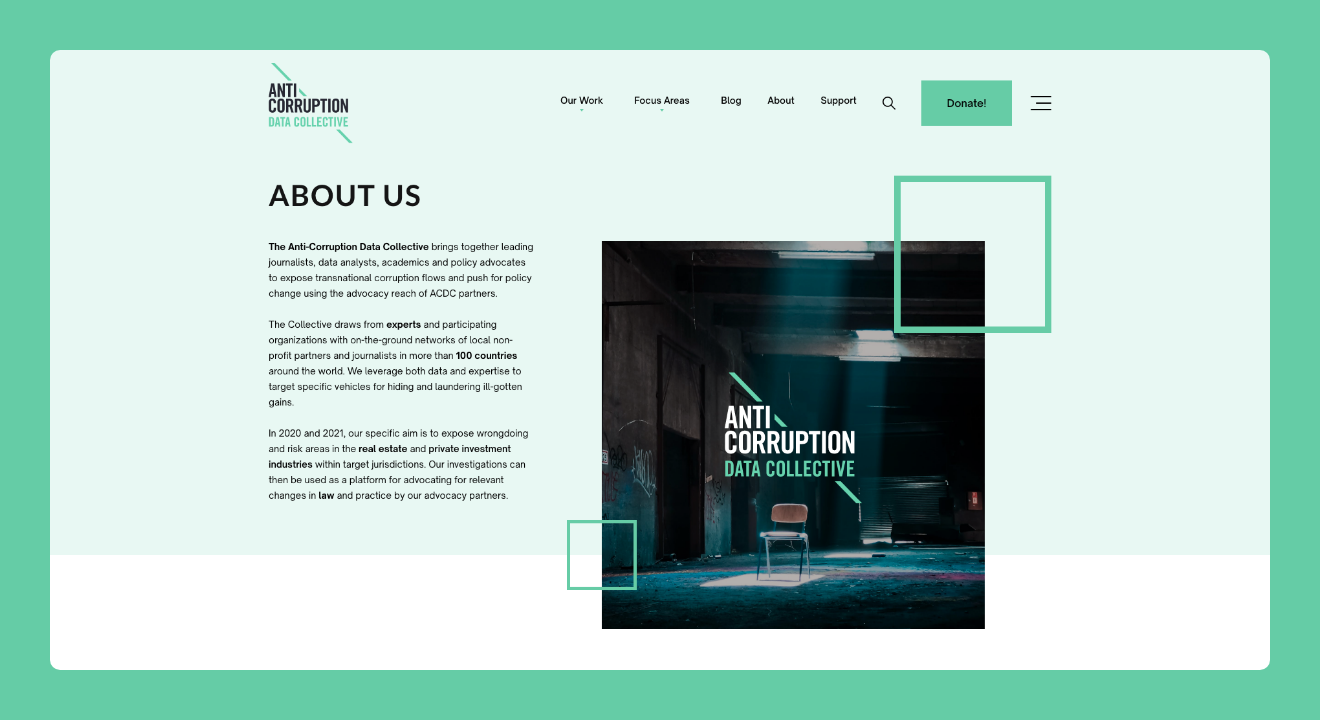
- The use of typography – refers to fonts, letter spacing, layout styles, and more. Designers often opt for customized typography to be unique and memorable.
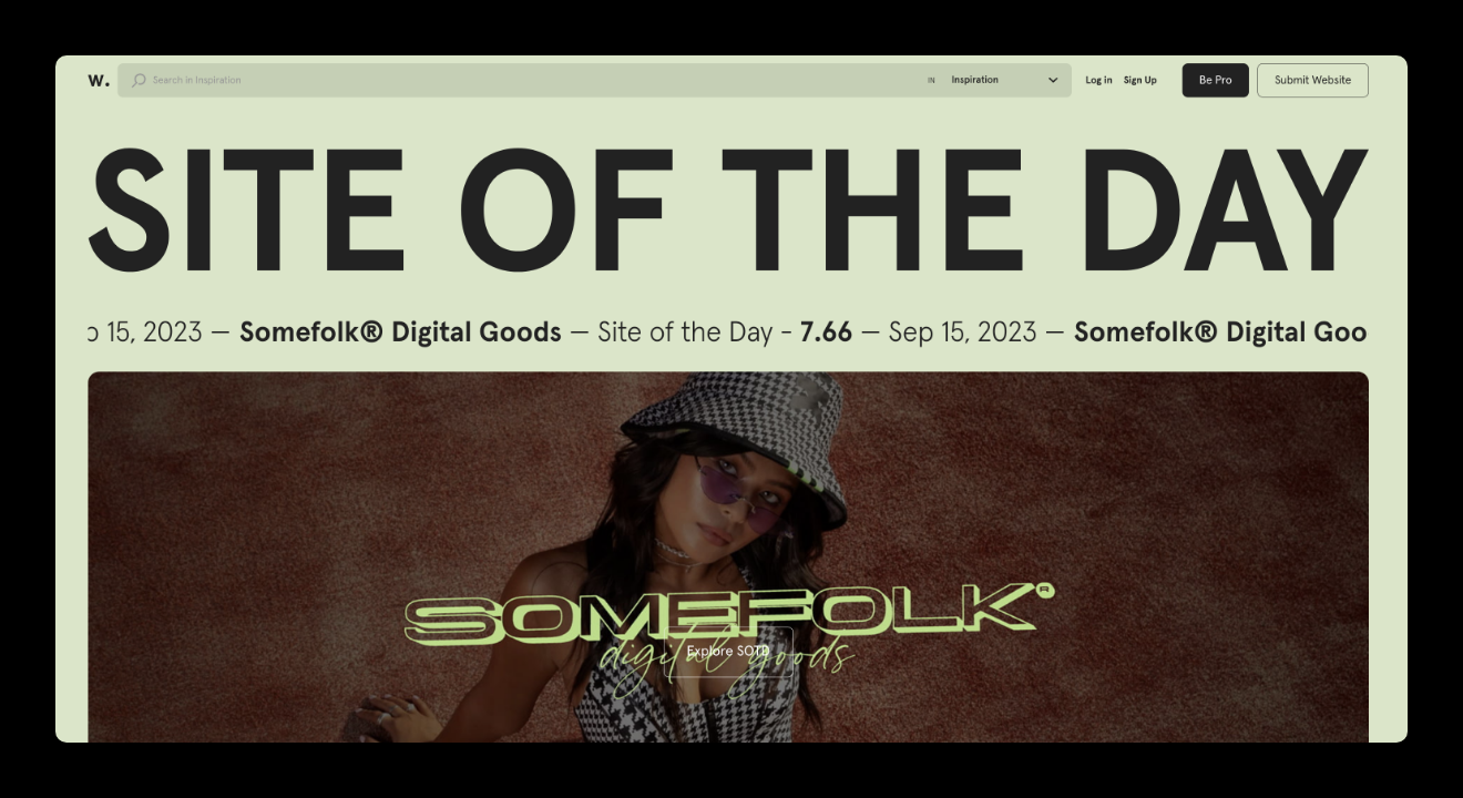
- The use of color – an essential element of web design. Berlin designers often use bold and vibrant colors.
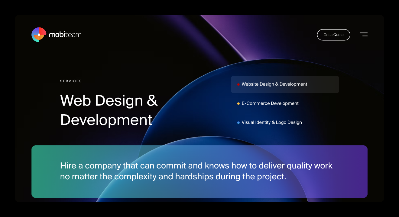
- The use of illustration – a great way through which designers choose, to add personality to a website.
- The use of animation – that adds interest to a website. Berlin designers prefer animation because it creates a more interactive and engaging experience.
That being said, we can continue presenting the top web design trends in Berlin.
Berlin’s Latest Web Design Trends: Mobiteam’s Approach
Minimalism
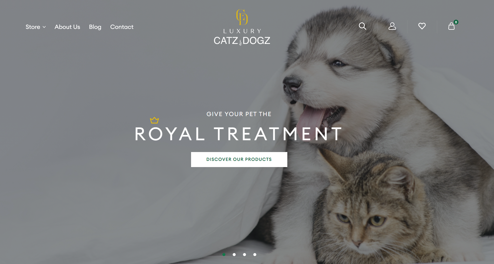 Minimalism is a popular trend in web design, especially in Berlin. It is characterized by white space, large fonts, clean layouts, simple typography, and simple navigation.
It is a versatile design style that can be used for a variety of websites, from personal blogs to corporate websites.
There are also a number of other benefits to using minimalism in web design, such as:
- Improvement of user experience
- Faster website loading, because of fewer elements and less code
- A more memorable website that helps to build brand awareness
- It’s easier to maintain, this can save time and money.
LuxuryCatzandDogz website created by Mobitean is a great example of minimalist web design. The homepage is clean with simple typography, and a limited color palette. The homepage presents a large hero image of a cat and dog, with the website’s logo and tagline overlayed. The navigation bar is also simple and uncluttered, with just a few links to the most important pages.
Bold Typography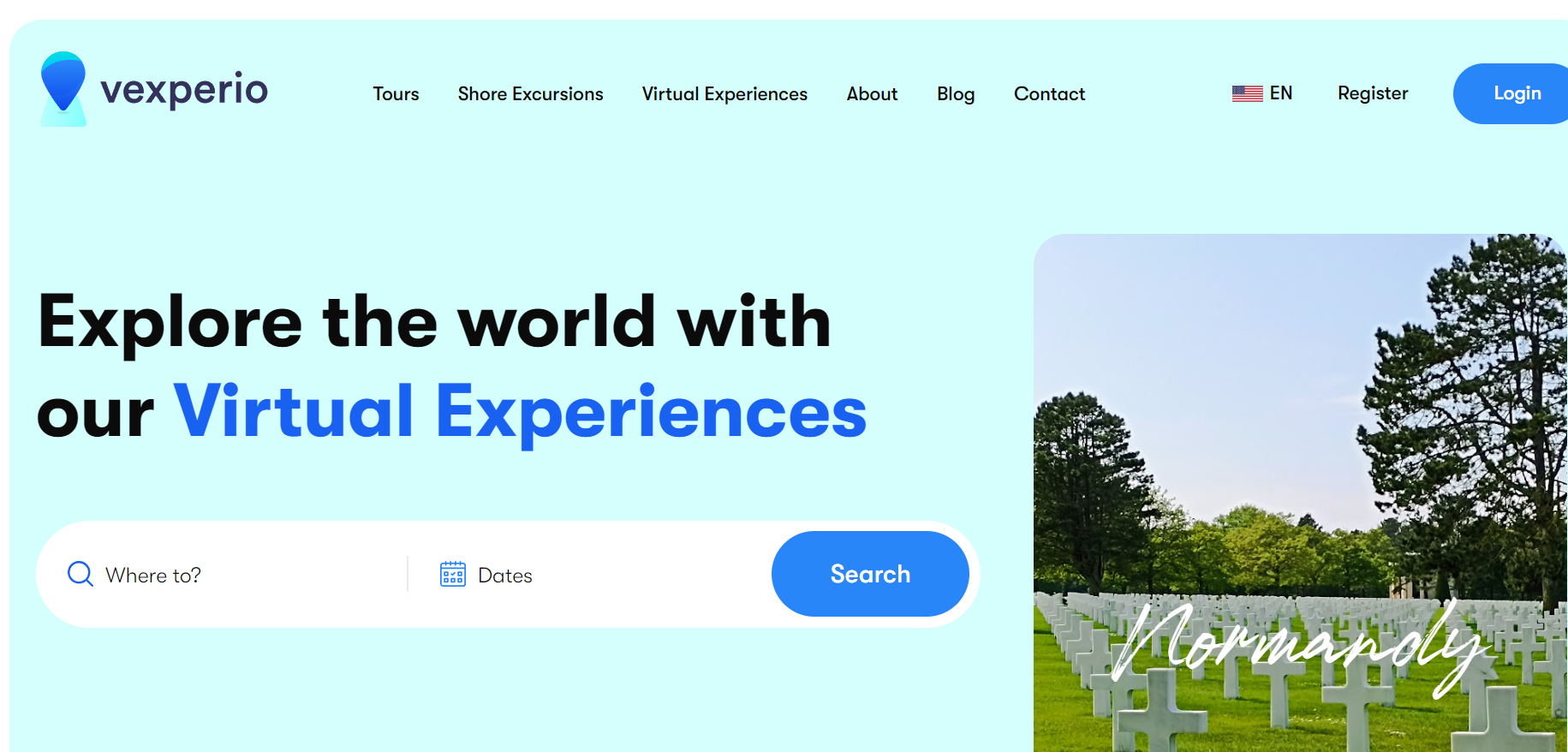 Bold typography is a design trend, that uses large bold fonts and it is often seen in headlines, call-to-action buttons, navigation menus, and other important text elements on a website.
Bold typography:
- captures the attention
- improves readability
- creates a sense of hierarchy and importance
- adds personality and style to the website
- increases brand awareness and click-through rates on call-to-action buttons and other important links.
Designers can create websites more visually appealing, readable, and effective, by using bold typography correctly and creatively.
Some of the most popular bold typography trends in 2023 are:
- sans-serif fonts like Roboto, Open Sans, and Montserrat
- serif fonts such as Georgia, Times New Roman, and Baskerville
- display fonts that include Gotham, Playfair Display, and Ralewayas, as well as others.
Vexperio is a good example of the current trend of bold typography in web design. It was created by Mobiteam. Vexperio uses bold typography in the headline on the homepage, in the navigation bar for the main categories, and in the product descriptions to highlight key features. Bold typography helps to create a sense of excitement and adventure, which is appropriate for a website that offers live interactive virtual experiences in Europe.
Bold Colors
Bold colors is another popular trend in Berlin web design.
Web designers prefer to use bold colors to make a website memorable, fill it with vitality and emotions, and create a sense of mood: excitement, happiness, creativity, passion, or calmness depending on what the veil palette is used.
Some of the most popular bold colors in web design are:

- Electric blue can be used as a main color or as an accent color
- Neon pink is perfect for creating a fun and playful atmosphere and can be used to highlight important elements.
- Vibrant yellow is associated with happiness and optimism and creates a positive and welcoming atmosphere.
- Lime green evokes a sense of nature or freshness
- Orange is a warm color and is perfect for creating a sense of excitement or energy.
- Royal blue is associated with luxury and sophistication and creates a sense of authority and trust.
When choosing colors for your website, it is important to consider the overall look and feel you want to create, as well as the target audience it will be for.
If you opt to adopt this trend your site will grab the attention, evoke different emotions in people, create a sense of hierarchy, highlight important elements, and increase brand awareness.
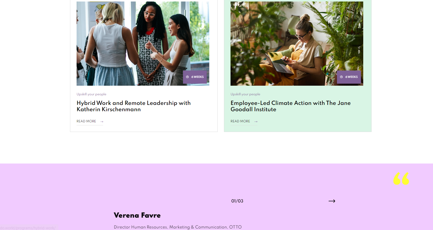
 The DO site was created by Mobiteam and is a good example of the bold color trend in web design. The website uses a variety of bright and vibrant colors, such as blue, green, pink, and orange, to highlight different features on the website, such as articles, videos, and other events. The use of bold colors on this website is effective in creating a fun and energetic atmosphere.
Dark Mode
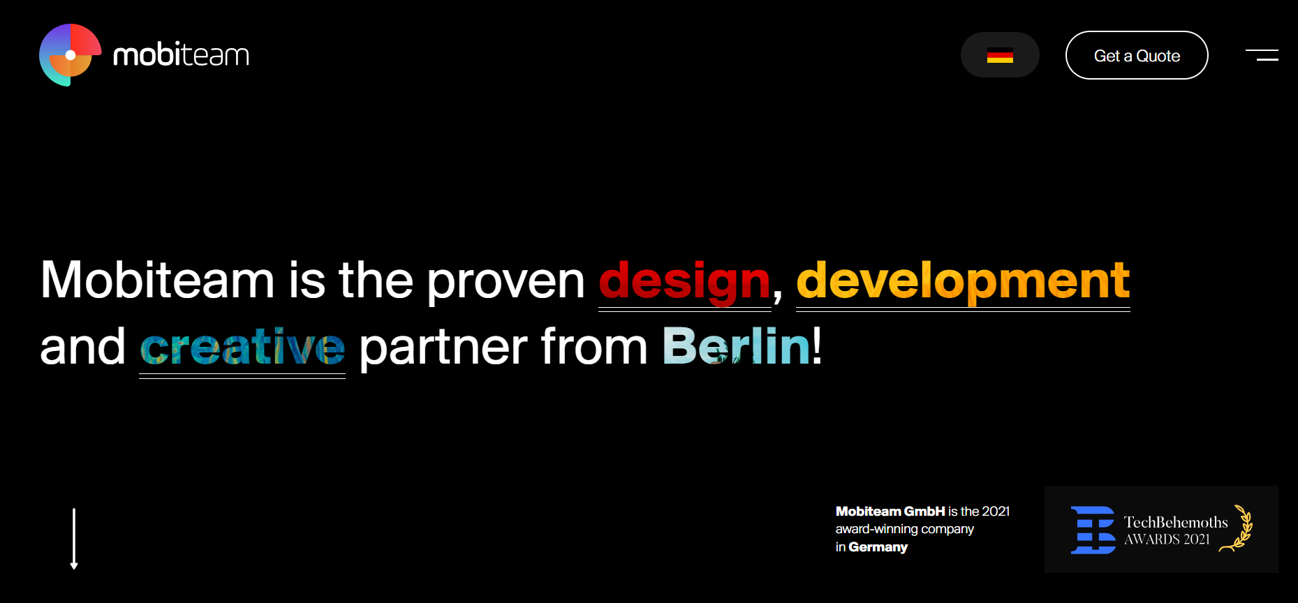
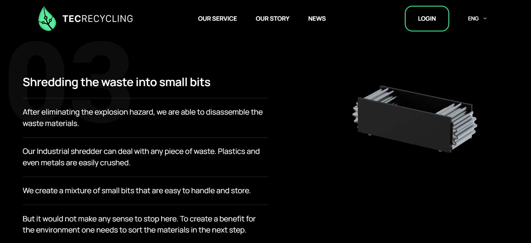 Dark mode is about using a dark color theme with a black or near-black background and light-colored text.
Dark mode isn’t just a trend – it’s a statement. Berlin’s designers are using dark backgrounds to create a sense of luxury and sophistication, which is often used in high-end products and services. Coupled with vibrant accents, this trend has gained popularity in recent years.
Some users prefer dark mode design in a special way, being simply more aesthetically pleasing to them
Dark mode can help to reduce eye strain because it lowers the amount of light emitted from the screen, especially at night or in low-light environments, and can improve battery life on devices with OLED or AMOLED displays because these types of displays use less power when displaying dark colors.
If you are going to choose this design here are some tips to follow:
- Make sure that the text is well-contrasted with the background so that it is easy to read.
- Use high-quality images and graphics that are still visible in dark mode.
- Use different colors and shades of gray to create visual interest and help users distinguish between different elements.
Mobiteam website and TecRecycling are good examples of using dark mode design. The contrast between the black background and white text makes the sites easily readable helps to create a sense of calm and focus and also creates a powerful and trustful atmosphere.
Interactive Elements
 Interactive elements is a great trend, preferred by Berlins designers. It is about using of animation, videos, and other multimedia content that engage users and let them interact more with the website.
Interactive elements include also things like
- Scrolling effects
- Drag-and-drop features
- Gamification elements
- 3D and VR experiences.
Interactive elements are an important web design tool, having an important impact on users and making a site:
- To be more attractive
- Help users understand the content more easily
- Increase the time users spend on a website
- Improve the conversion rate of a website.
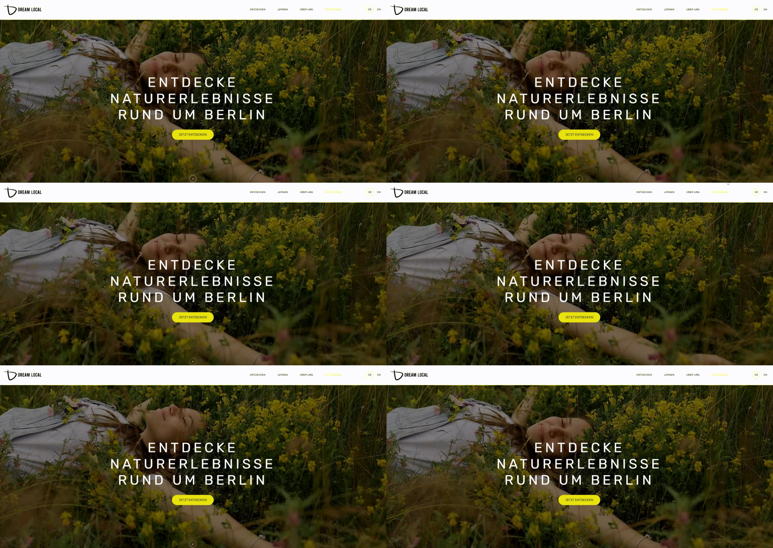
Dream Local was created by Mobiteam and is a good example of using interactive elements to engage visitors and make the site more user-friendly. The homepage features a video that plays when the page loads and is a great way to introduce the company.
We notice the use of a number of effects to make the text and buttons more interactive, in this way more clickable. And, finally, the contact form allows visitors to get in touch with the company directly, making the site more interactive.
To wrap up
In this article, we have explored some popular design elements and styles that define Berlin’s web design scene.
Through its projects, Mobiteam shows a shining example of how to keep pace with the latest design trends and how to seamlessly incorporate these trends into their work.
If you’re looking for a team to design a cutting-edge website, look no further than Mobiteam.


